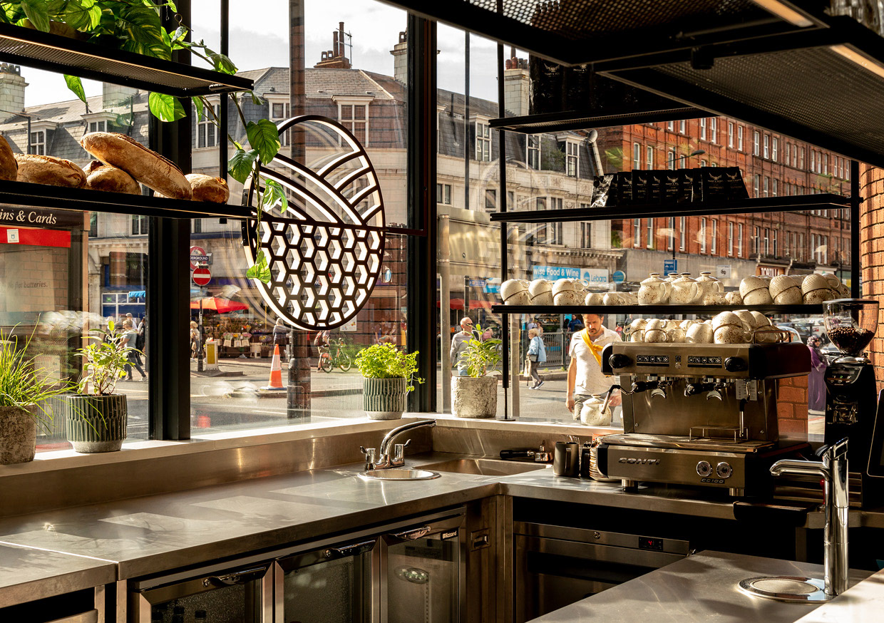
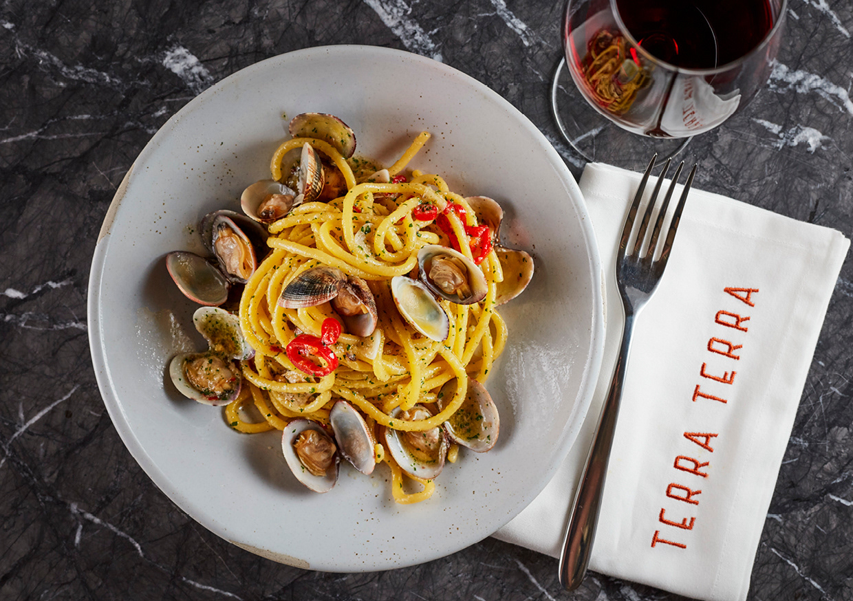
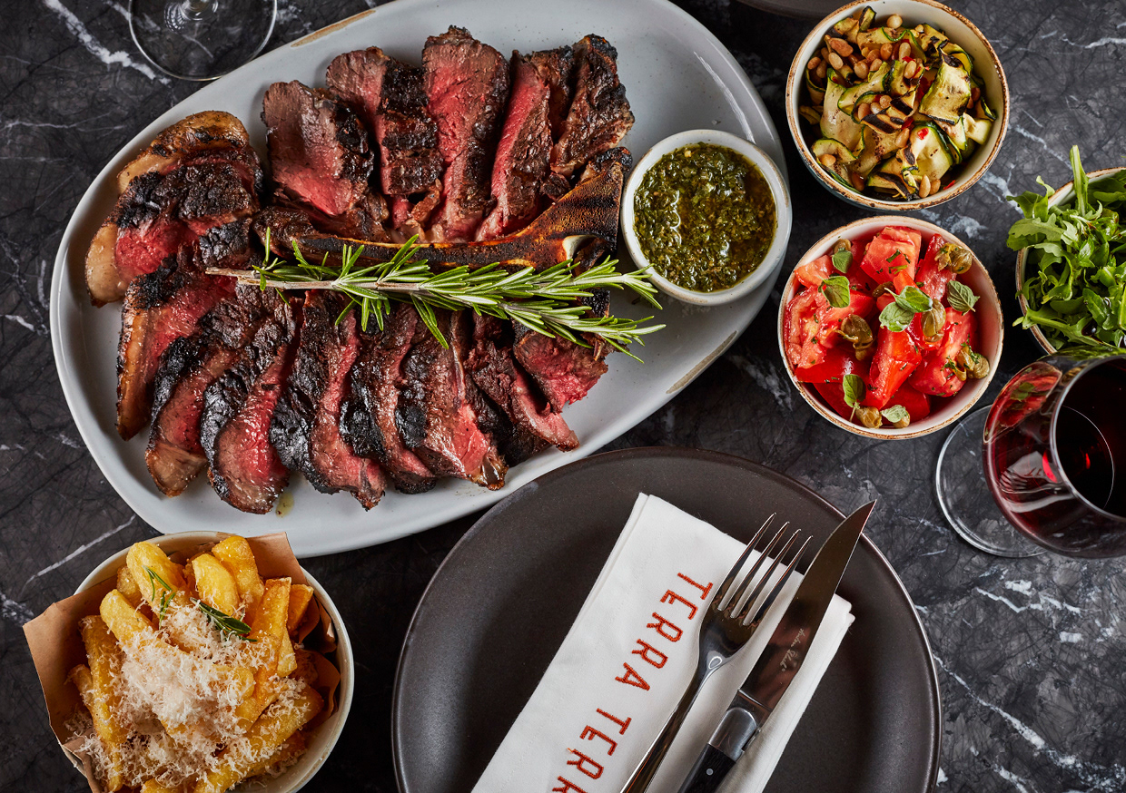
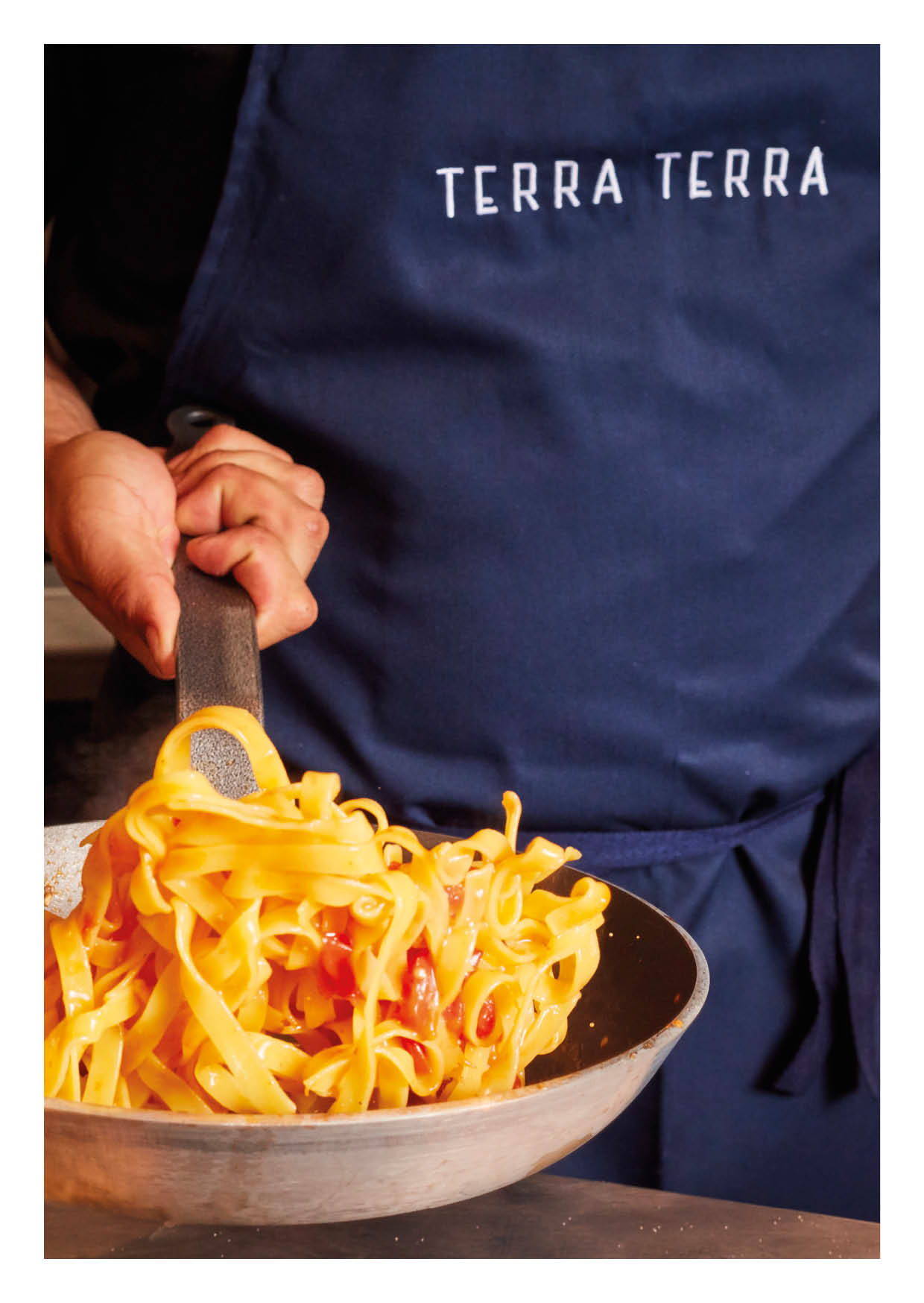
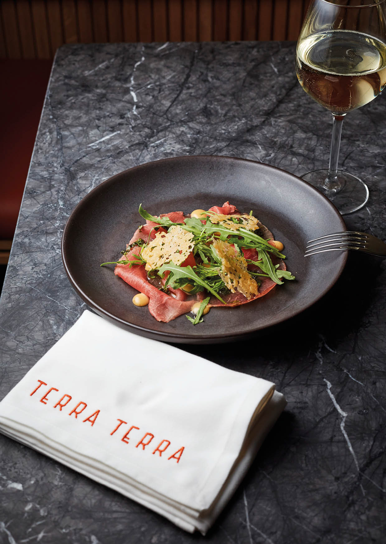
Terra Terra is a restaurant in London inspired by Florence and Bologna’s food markets. The chefs infuse new and old recipes along with cooking techniques to produce passionate, simple and pure Italian dishes.
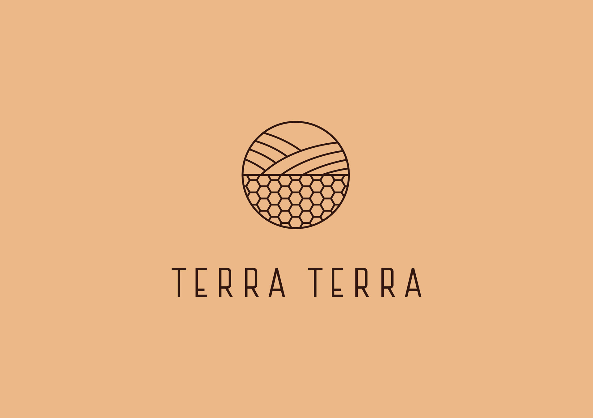
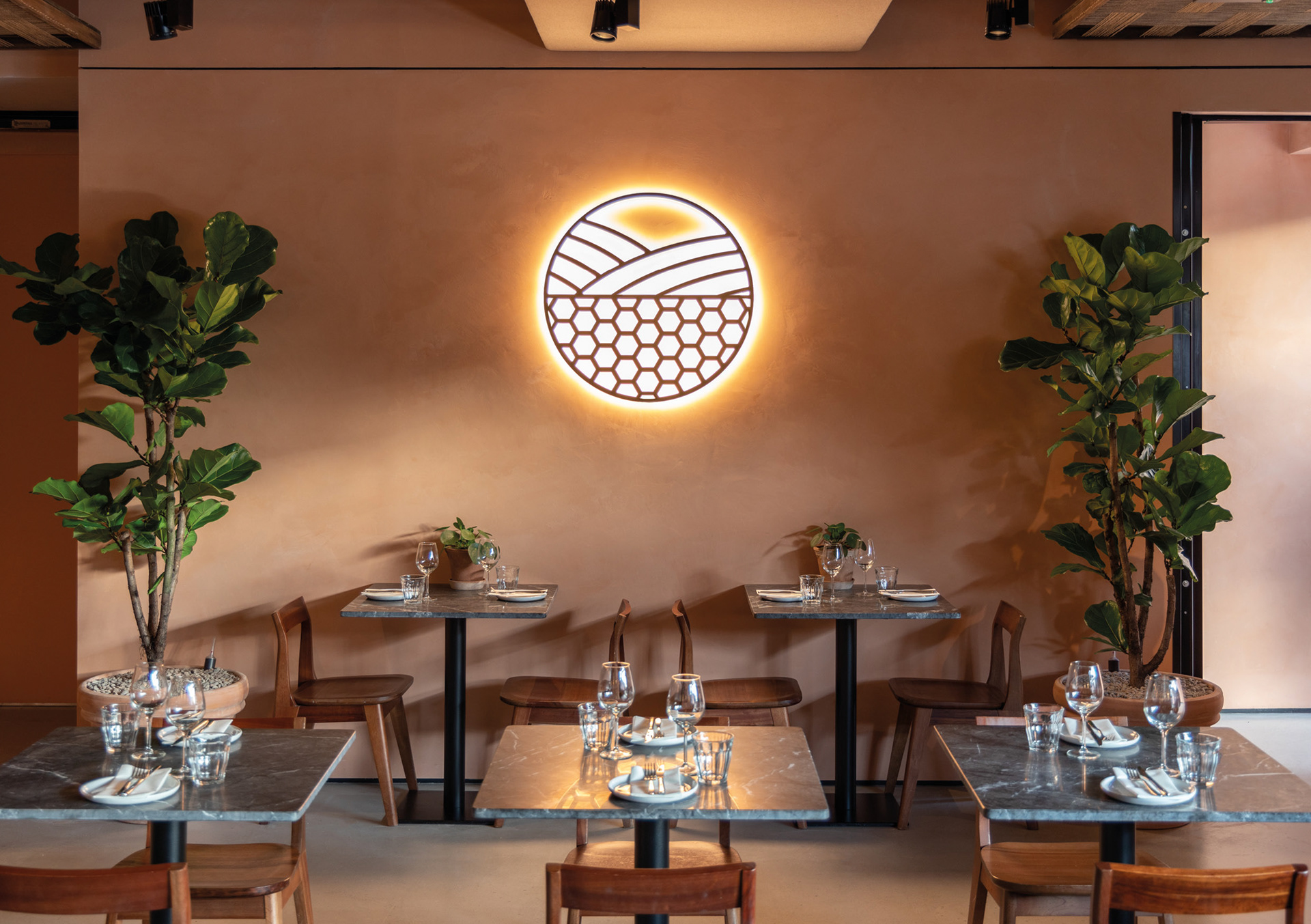
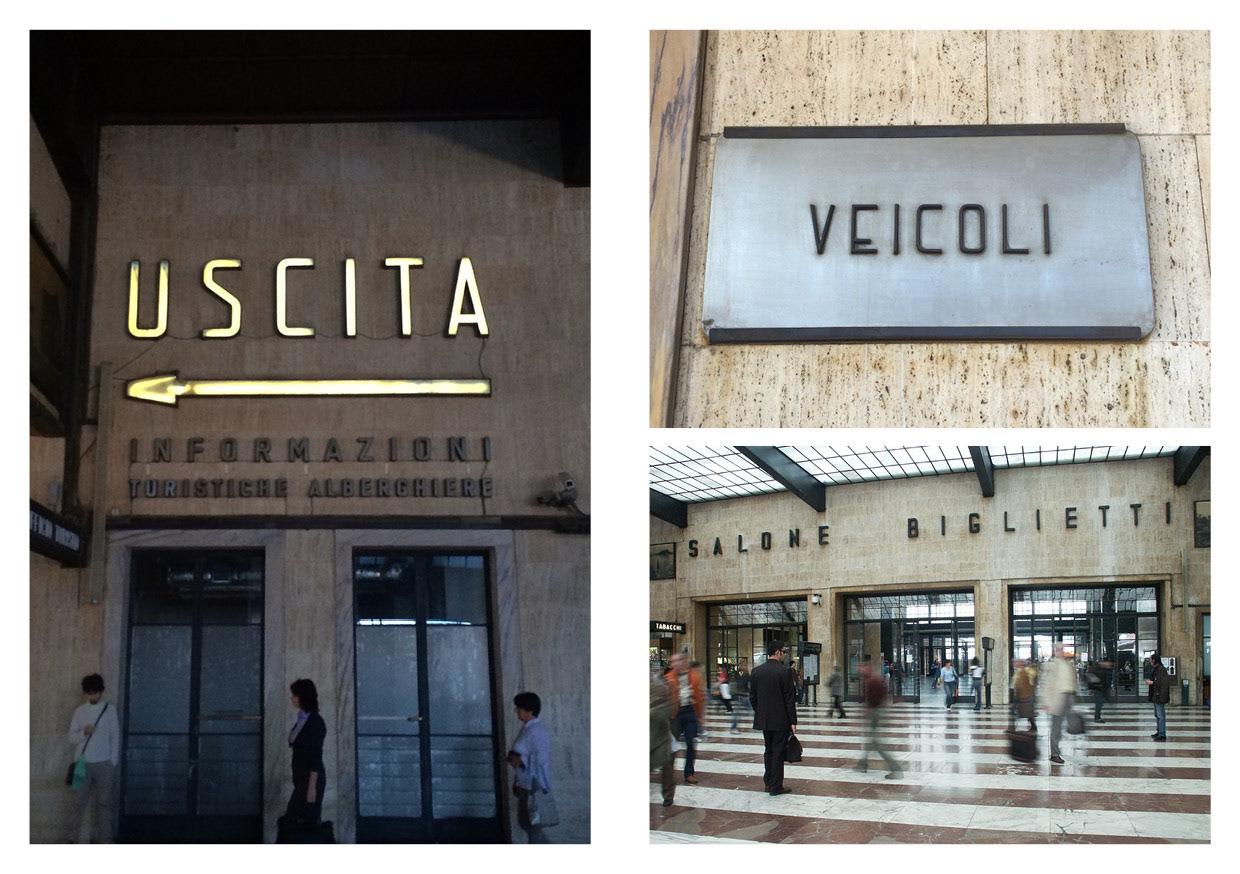
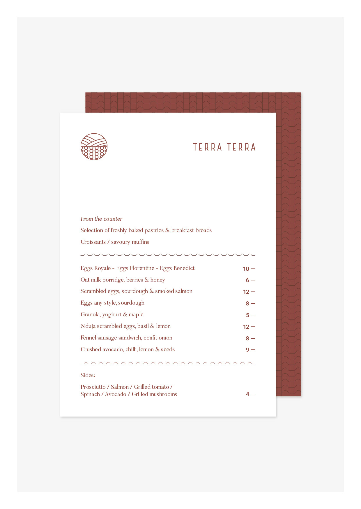
The symbol designed is a token of what is grown below and above the surface. It represents perfect pairings within dishes and Terra Terra's approach to food, whilst reflecting the dual nature of the restaurant. The handcrafted lettering is inspired by the perfectly preserved signage and letter forms present in Florence’s Statione Santa Maria Novella.
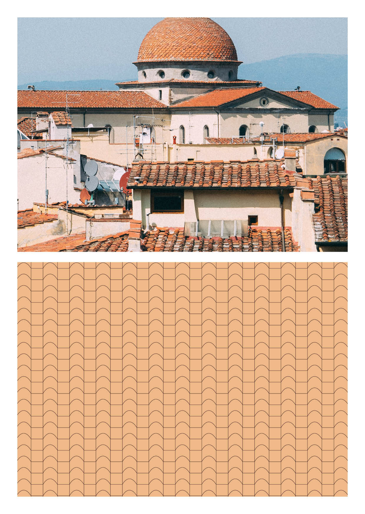
The logo is paired with a delicate pattern inspired by the terracotta rooftops of Florence and Bologna. Made from clay, this baked raw material comes from the ground we walk, farm and live on - the earth.